Redesigning AI Prompting: 
Invictus - Layered Control

This case study  explores how to translate complex LLM parameters into human-understandable, simple to use, 3-layer control design.
Most users can't easily control the underlying parameters that shape AI responses. Things like creativity level, response length, or output structure.

These controls exist. If you use an AI API, you can set temperature (how creative vs. precise), max_tokens (response length), frequency_penalty (variety in word choice), and system instructions (AI personality). Adjusting these dramatically changes AI behavior.

But accessing them? You need to know they exist, know how to prompt them, and understand JSON formatting. Non-technical users are locked out. But what if users could adjust these parameters directly, through simple interface controls, without learning what "temperature" means? 

This case study presents systematic research I did on this problem as part of my PhD research and experimentation. It's divided into steps I took:
1. The problem space
2. Systematic literature review of 70 academic papers from the last decade.
3. Global survey of 345 users across 46 countries on their usage of AI tools.
4. Audit of 10+ AI tools across 6 interface types against human-AI interaction guidelines.
5. Design of the interface interaction logic, based on previous steps.
6. Working prototype made by using Cursor.
23%
Increased
Conversion rate
8%
Lowered Cart
Abandonment Rate

10%

Improved Customer
Satisfaction Score
’’ Tanja Radovanović has demonstrated exceptional dedication, methodological rigor, and a deep understanding of the problem to date. Her work is logically coherent, well-founded, and relevant to both the scientific community and the industry. ’’
- Neda Milić Keresteš, Professor at the University of Novi Sad
Problem

The Lack of Prompting Guidance

Imagine this: 

The marketing manager types a vague prompt. Gets generic output. 

Tries again with more detail. Still not quite right. 

She wastes 20 minutes on something that should take 2. 

Maybe she even closes the tab. Back to doing it herself, without AI.

This happens millions of times a day. 

AI adoption is growing, but usage quality isn't keeping pace. This new wave of technology often promises simple communication - type or speak naturally, and get useful output. 
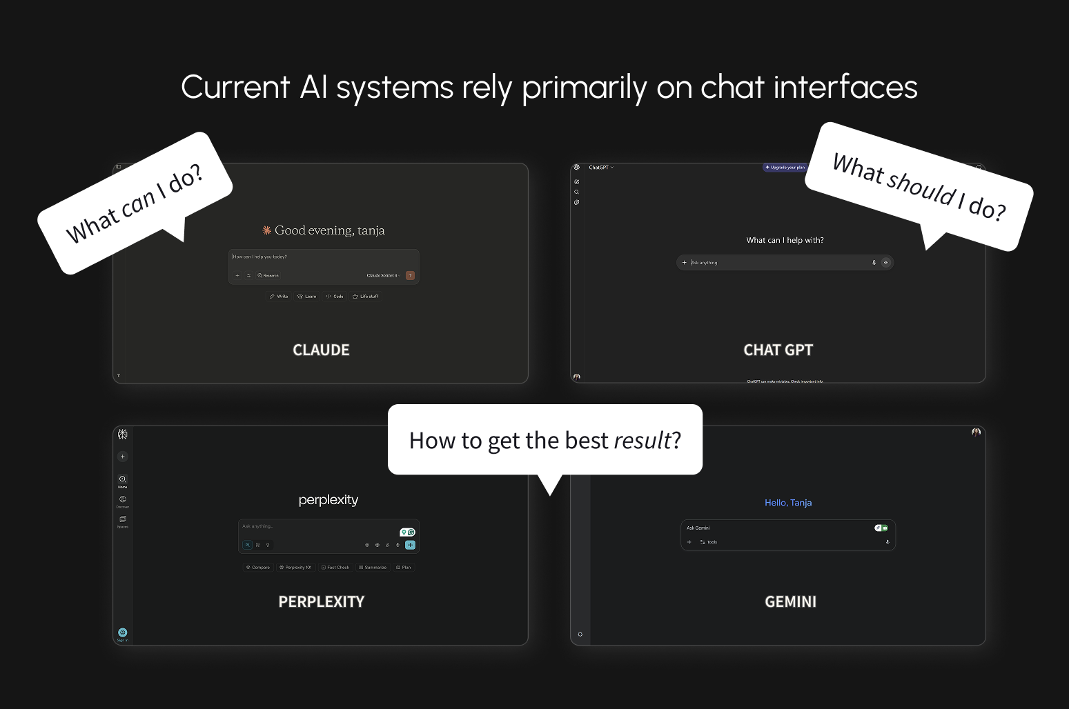
But in practice, many users discover that good results tend to require detailed, specific prompts. 

Non-technical users often receive limited guidance on what AI can actually do, where its boundaries are, or how to structure requests that work.

One response has been prompt engineering. Some users now maintain libraries of instructions in separate documents, copying them into every interaction. 

What was introduced as simple has become more complex for many.

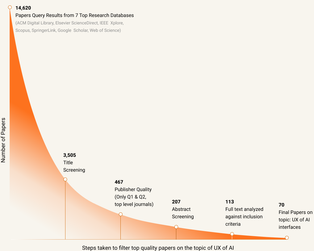
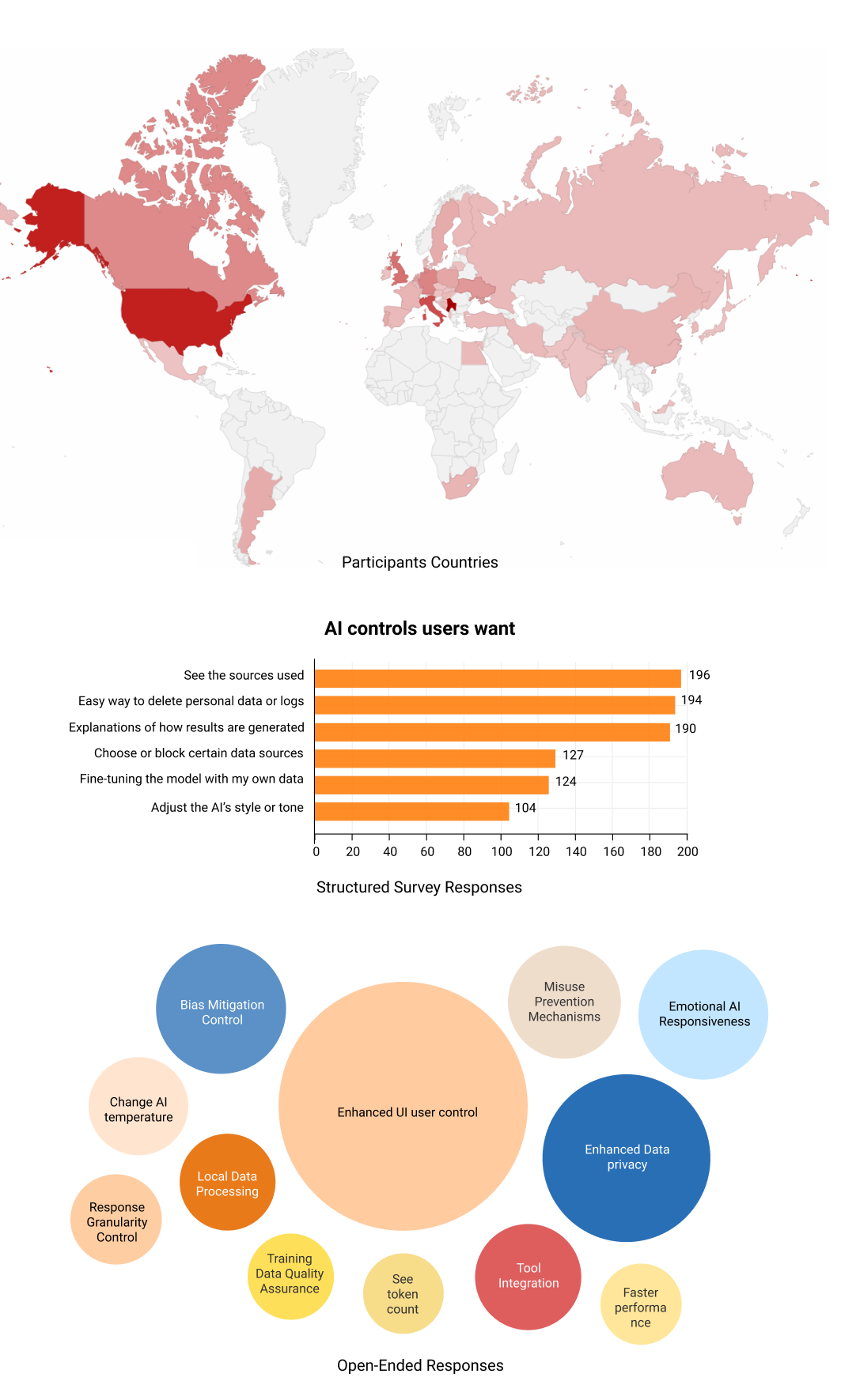
To understand how widespread this problem is, I researched users' AI usage patterns.

Most Noted

"Prompts need to be  very specific and detailed  to get good answers"
80% users
Said they want more control  over AI functionality.
42% users
Tried image AI once and never returned
Business impact:
High prompting burden affects AI adoption, increases support needs,  and widens the gap between AI's technical capability and extracted value.
Research
Timeline: 6 months

The Layered Research Process Behind

Establishing the foundation

Step 1: Systematic Literature Review

Before proposing solutions, I needed to understand what research already existed. I conducted a systematic literature review of the past 10 years' work on AI personalization in user interfaces, searching 7 research databases and applying PRISMA screening protocols.

70 peer-reviewed papers from top-tier journals and conferences made the final selection. Each was coded across 30 parameters to identify patterns, gaps, and validated findings.

The process took 6 months and resulted in a journal paper currently under peer review at a Q1 SCI journal in HCI. The paper serves as a foundation for designers navigating this rapidly evolving field.

Key finding: While AI adaptivity can enhance user experience, it also introduces friction when not implemented thoughtfully. The application needs to be nuanced, not universal.
Moving beyond lab studies to real-world usage

Step 2: Global Survey

Academic research often happens in controlled environments. I wanted to understand how people actually use AI tools in practice, across different contexts and professions.

I designed a global survey that reached 345 participants across 46 countries. Respondents ranged from academics to artists, marketers to engineers, providing a genuinely diverse perspective on AI usage patterns.

Beyond quantitative data, we collected nearly 400 written responses detailing specific frustrations, desired features, and interaction patterns.

Key findings: Users want enhanced control over AI personalization. Prompting needs to be easier and more guided. Seeing sources matters. 80% want more control over AI functionality. 
Mapping the current landscape

Step 3: AI Tool Audit

I audited contemporary AI tools to document current interaction design patterns and identify gaps. Tools were grouped into 6 interface archetypes: multimodal chat interfaces (ChatGPT, Perplexity), image generation (Midjourney, Leonardo), video (Runway), software generation (Lovable, v0), canvas-based (Miro), and agentic AI (Zapier AI, n8n).

Each tool was evaluated against 20 AI design guidelines selected from Microsoft's Human-AI Interaction Guidelines and Google's People and AI Guidebook. I documented user flows from initial prompt to final result, creating an original audit framework and a 50-page analysis of the current state.

Key findings: Most tools lack meaningful user control mechanisms. Tools either overpromise capabilities or are difficult to prompt effectively. The "empty chat box" pattern dominates all interface archetypes.
THE DESIGN THESIS

The right amount of control at the right time

Why existing solutions fail:
- Chat-only interfaces assume everyone is a prompt engineer.
- Parameter dashboards assume everyone wants to tinker.
- Ignoring how humans actually work: set preferences once, adjust in the moment, refine after seeing results.
GRANULAR CONTROL

The Invictus Framework: Three Layers of Control

The framework emerged from watching how users naturally tried to interact with AI. Three layers, each serving a different moment in the workflow.

Layer 1: Project DNA – Set it and forget it
Persistent defaults that travel with you. Your role, tone, and format preferences. The AI remembers, so you don't repeat yourself in every prompt.

Layer 2: Prompt Controls – Override in the moment
Four quick adjustments above the chat: length, tone, task type, and format. When you need formal instead of casual, detailed instead of brief, without changing your defaults.

Layer 3: Section Editing – Refine without restarting
Select any part of the response and adjust it. Expand this section, improve that paragraph, find sources for this claim. No need to regenerate everything.

The logic: Most recent control wins. Prompt Controls override Project DNA. Section Edits override the original response. This matches how humans think: "I usually want X, but right now I need Y."
Why this works:
- Novices see a simple chat interface.
- Controls reveal themselves progressively as users engage.
- Power users get granular control without UI clutter.
- Everyone gets exactly the complexity they need, when they need it.
- Giving users control without requiring them to understand the technical implementation
THE DESIGNS

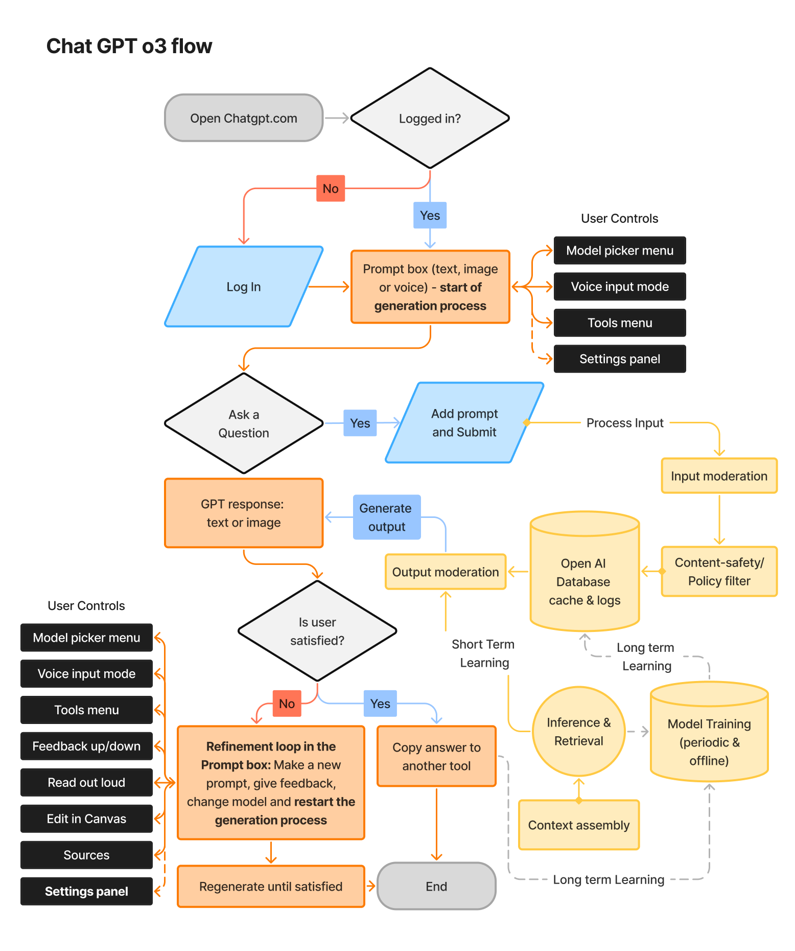
How the layered control system works in practice

The data oscillated from brand to brand, so the approach needed to be adapted, while the red connecting line also needed to be found, which was a big challenge.
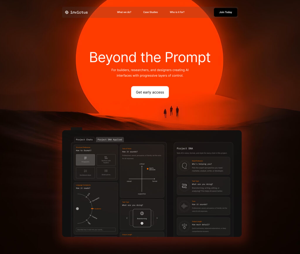
Layer #1

Project DNA - Your AI Remembers

Problem: "I'm retyping 'be casual' in every prompt."
Solution: Drag-and-drop cards for role, tone, length, structure
Design decision: Why cards instead of forms? Cards feel optional and playful. Only activate what you need. Forms feel mandatory and tedious.
Research tie-in: 80% want control, but not if it feels like work. Cards reduce friction.
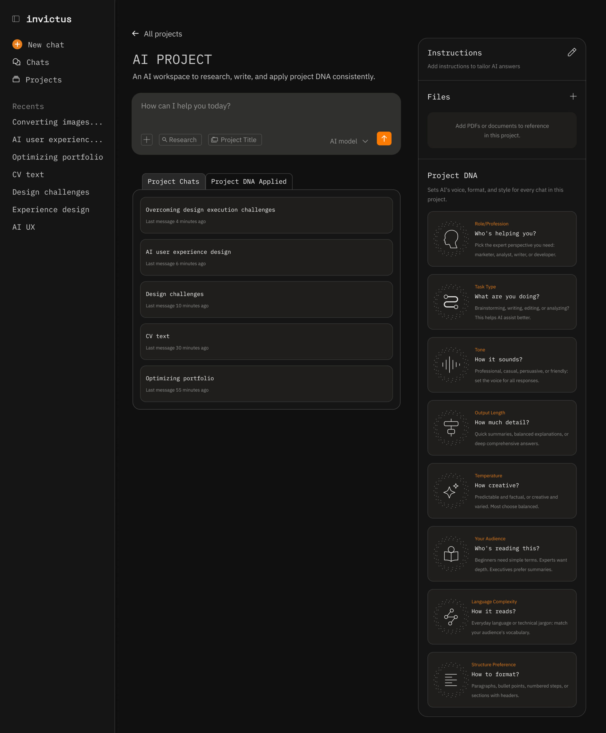
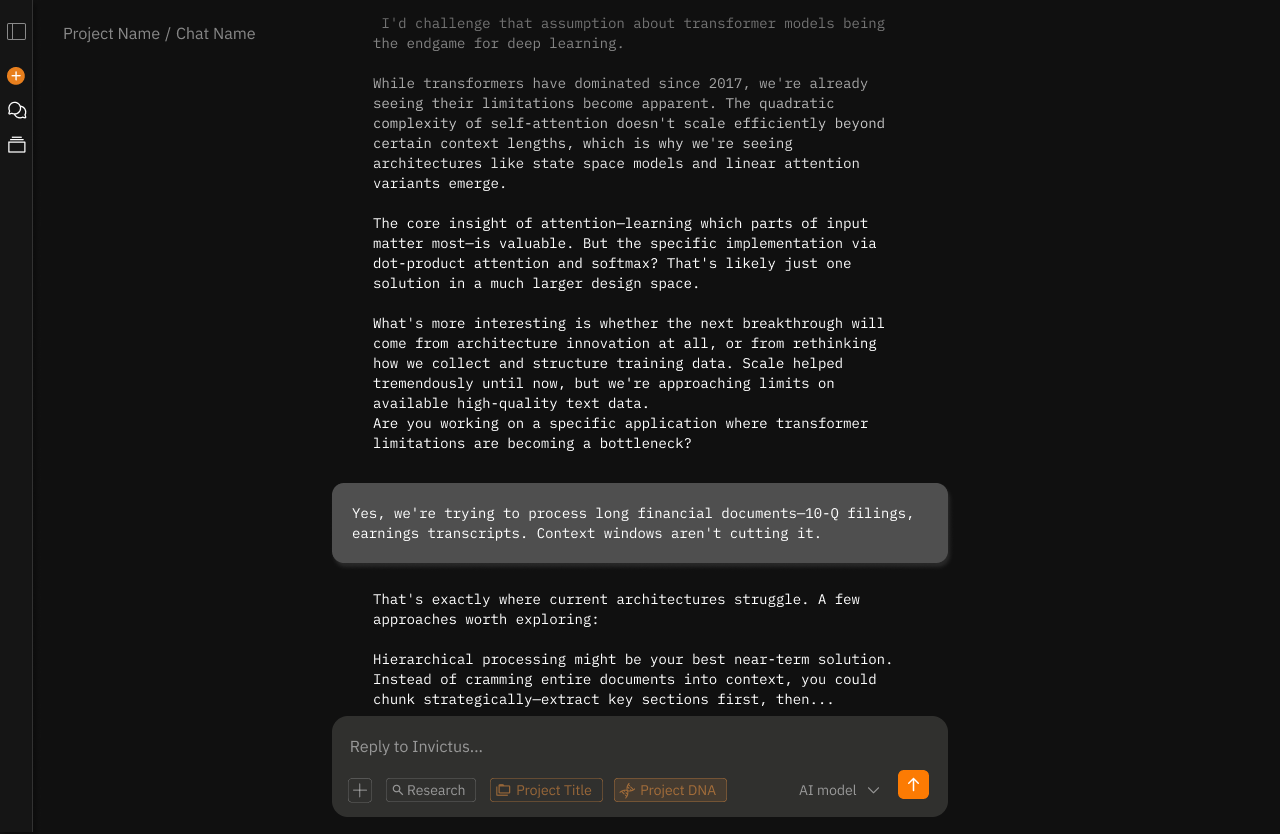
^ the default project screen with previous chats. The Project DNA is in the right side panel, and it's optional for users that don't feel they need more control over their AI responses.
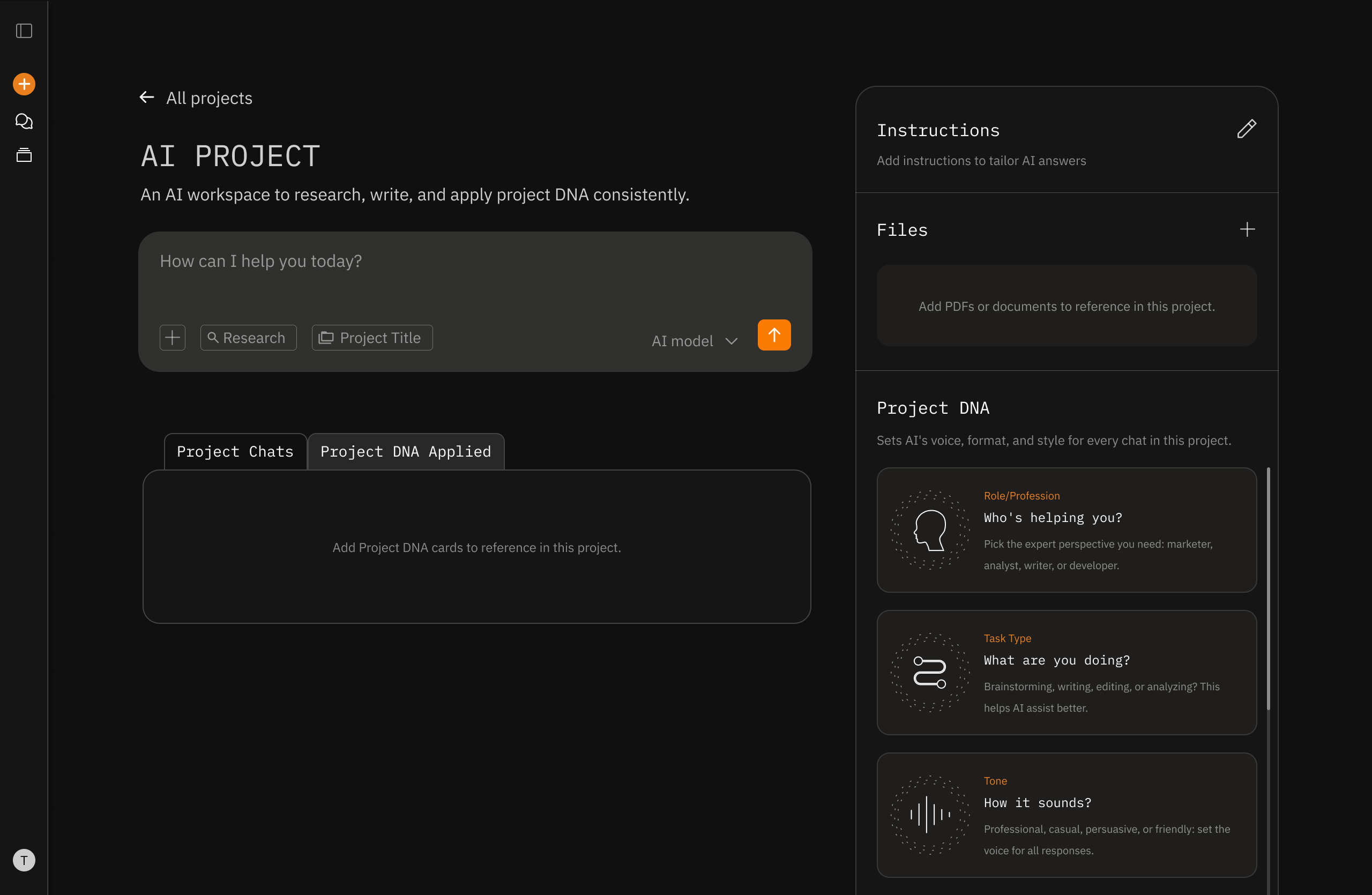
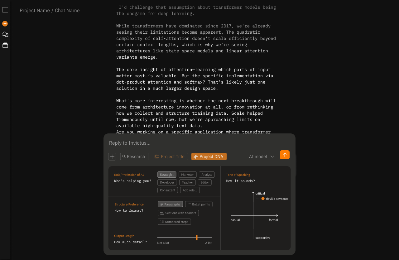
^ the Project DNA applied tab opens a box to drop cards to activate them. The user can activate 1 or all. 
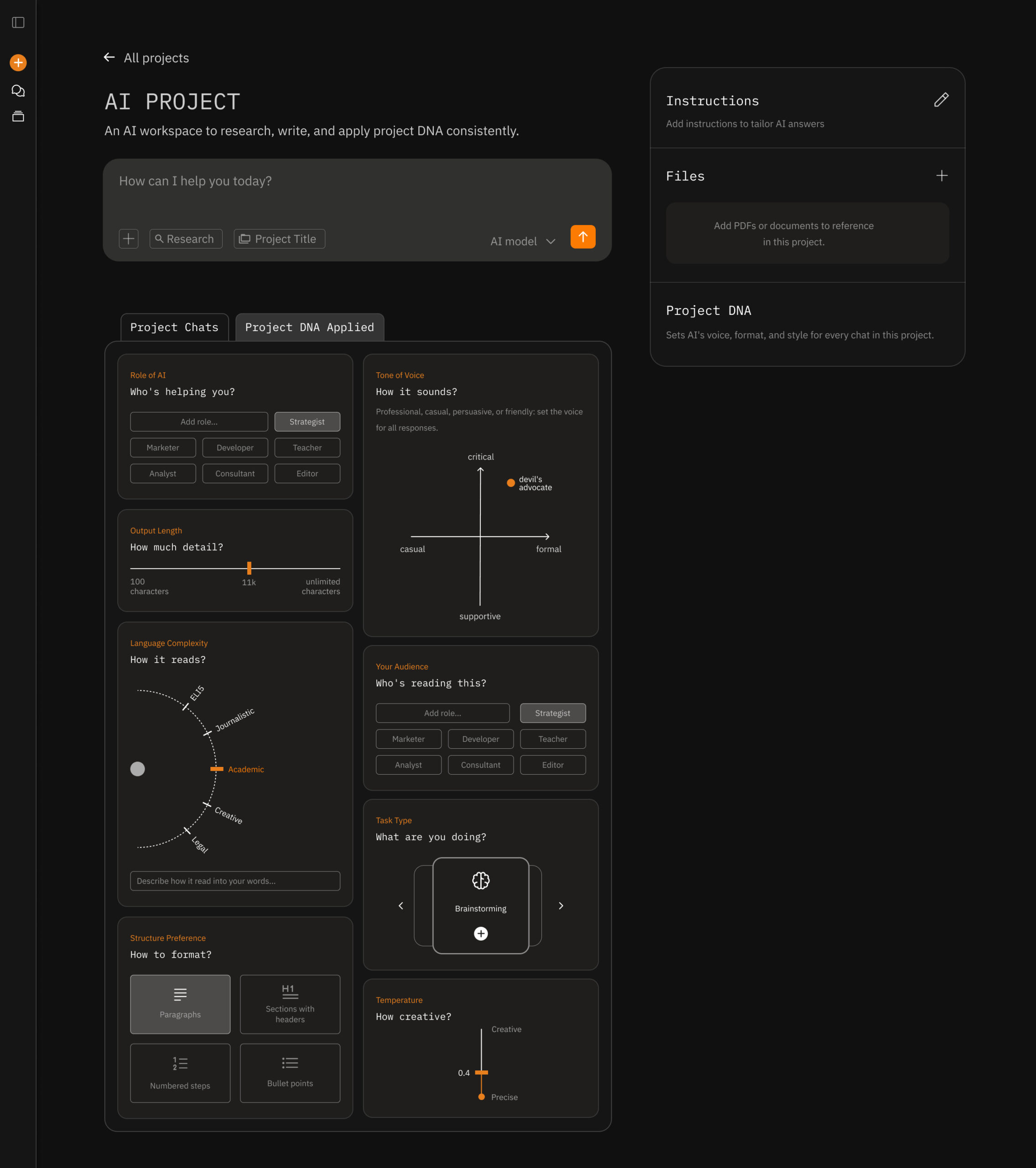
^ the Project DNA cards were iterated on multiple times, with a goal to make them more fun and gamified. I wanted them to be clear in their function, but to avoid users having an overwhelimng feeling of setting up a dashboard. Each card has motion design to bring that delight. The card can be removed by clicking X or dropping it back to the right side panel.
Layer #2

Prompt Controls - In-the-Moment Flexibility

Problem: "My Project DNA is casual, but I need formal right now."
Solution: Four controls above the input: length, tone, task type, format
Design decision: Why only four? Analysis of user requests showed these four account for 80%+ of in-the-moment adjustments.
Research tie-in: Control paradox - too many options overwhelm. Four is the sweet spot.
^ while chatting the user might want to fine-tune the AI responses to match the topic they are working on in the moment.
^ that's why they can access Project DNA through the chat box also. These settings would override the project settings.
Layer #3

Section Editing - Collaborate, Don't Regenerate

Problem: "One paragraph is wrong, but I have to regenerate the whole thing."
Solution: Select text → contextual menu appears (Expand, Improve, Find Source, Ask AI)
Design decision: Why these four actions? 57% of users want to see sources. Users want collaborative refinement, not binary accept/reject.
Research tie-in: 6x satisfaction boost from editing. Users want agency over outputs.
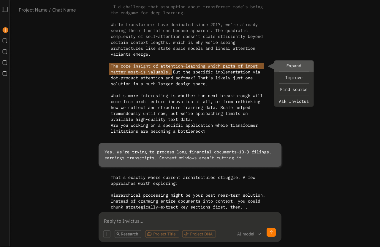
^ maybe the user wants to expand on one good sentence in the text, improve one particular paragraph, or find a source for a particular statement? These granular settings give the user more control over output iteration and make it simpler for the LLM to understand exactly which part to edit and how.
VIBE CODING

Building in Cursor

I'm prototyping Invictus AI in Cursor, using AI-assisted development to move fast. Connected Figma via MCP to pull design tokens directly into code. As a designer, prototyping with AI tools like this changes everything - I can test motion, states, and interactions in real time. Every iteration that actually works feels like unlocking a new capability.

The prototype isn't pixel-perfect yet, but it's functional enough to reveal what static designs couldn't.

Current state: 80% there, refining interaction details.
VALIDATION & IMPACT

How it will be tested & what success looks like

Tests: Controlled A/B testing against standard chat interfaces. Participants complete identical tasks while we measure efficiency, adoption, and satisfaction through standardized UX methods and behavioral tracking.

4 metrics that drive satisfaction and business outcomes

Time to first success: 20-30% reduction in time from first prompt to usable output.
Task completion rate: Higher percentage of users achieving their goal without abandoning.
Feature adoption: 40%+ of users engaging with layered controls within first three sessions.
Return rate: Increased D7 and D30 retention compared to standard chat.

Success means users get value faster, accomplish more, and come back consistently.
LEARNINGS

Impact, Learnings and What's Next?

Testing this framework taught me that control preferences vary dramatically by user type. Technical users want granularity. Non-technical users want simplicity. The three-layer system bridges this gap for text-based interaction, but it still requires users to understand what controls do and when to use them.

The broader impact

This research contributes three validated outputs:

- A systematic literature review (under peer review at a Q1 journal)
- Global survey findings on AI control preferences (submitted to a top-level HCI conference)
- An experimental validation of layered control mechanisms (in progress)

The framework will be released as open-source design guidelines that can be applied immediately in industry. The goal isn't just academic contribution but to have a practical impact on how AI products are built.

The next question: 
What if the interface required no controls at all?

Voice interaction removes the cognitive overhead of choosing controls. 

Users speak naturally, and the system interprets intent without requiring them to understand parameters, toggles, or hierarchies.

For non-technical users, this could be transformative. No learning curve. No interface literacy required. Just conversation.

My next case study explores this direction: designing voice-first AI interfaces that adapt to user intent without requiring explicit control mechanisms. The hypothesis: for certain user groups and use cases, the best interface is the one you don't see.

Next Case Study: Emotional Design

Capturing real-time body signals, heart rate, skin conductance, and movement, an AI app interprets emotional states that will provide users with actionable insights and device personalization.
Under Construction ↗

You’re not just hiring a designer, you’re gaining a partner who is invested in your success.

Ready to make something great together?
Helping founders elevate their Product’s UX and Drive Results.

Subscribe for monthly UX tips

* indicates required

Intuit Mailchimp

Sign up:
This site was designed and built by Tanja Radovanović.
© 2026 · All rights reserved